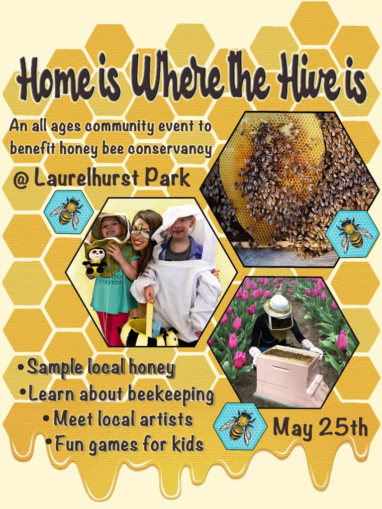
When starting this project I wanted to make sure that I was selecting a topic that would strongly support and accurately represent the primary theme of my blog. Something that could successfully combine the non profit sector with art, and showcase how art can be used as a tool to help people and communities. I decided to focus on the issue of Honeybee Conservancy because it is an issue that is near and dear to me. I have several friends who are beekeepers, and I think that their roll in the environment is as critical as it is fascinating.
After selecting my topic, I began to establish what the basic aesthetic aspects of my design would be. I chose to use a warm pallet of “honey colors” as the foundation and initial inspiration. Aside from the obvious reasons for picking these colors (honey bees = honey colors), I also chose them because of how well the colors lent themselves to the hexagon pattern of honeycomb. I’ve always loved strong geometric patterns and I wanted to utilize the hexagon shapes within my design. When I began to combine the two design choices I noticed they created a subtle retro-geometric 70s pattern, so naturally, I decided on a 70s retro font style for my headline. I experimented with dozens of fonts available in Photoshop, but was unable to find the right one for this project. I decided to use a website called “Dafont“, that I had used in the past, as a resource for obtaining a headline font. The site has hundreds of unique fonts that are free to download, and free to use for non-commercial purposes.
To create the background hexagon pattern in my design, I used the paintbrush tool to draw a simple yellow hexagon and then “cloned” the shape by holding down option + command on the keyboard, then clicking and dragging the hexagon. I repeated this process until I had several of them, and then selected all of them by using the wand and holding down shift, and then repeated the “clone” command. This way I was able to able to ensure uniformity amongst the hexagon shapes in the pattern and arrange them however I wanted. Since each time a “clone” is made, a new layer is automatically created, I made sure to merge all of the hexagon layers into one layer after I was finished placing them into the pattern that I was trying to accomplish. In order to give the honeycomb pattern some character, I selected a few of the individual shapes with the wand selector tool, chose a lighter shade of the honey-yellow color, and then used the paint bucket tool to fill in the shapes that I had selected.
In addition to the honeycomb, I was inspired to add some honey to my background design after submitting the draft. I decided it would look best as a detail at the bottom of the poster, I wanted it to appear to be dripping off the bottom of the pseudo-honeycomb pattern. To do this, I created a new layer, used the eye dropper to match the color, and then selected the paintbrush tool to draw the drippy honey. In order to make it look a little more realistic, I chose to add a subtle gradient effect. To do this I created a vector mask and utilized the gradient tool to draw a gradient that went from the top of the honey to the bottom. The final details I added were the white highlight lines along each curve of the honey drips. To do this I used the paintbrush tool, selected the color white, changed the size of the paintbrush to approximately three pixels, and drew a highlight line along each curve. To complete the highlights and taper off the ends of each line for a more finished look, I selected the smudge tool, changed the size to one pixel, and carefully smudged the ends of each line out to form a streamlined taper.
One of the final effects I chose to apply to the background at the end of completing the project was a texture over the honeycomb. I felt that the background pattern looked a little “flat” and I wanted to jazz it up a bit. To create the subtle texture effect, I selected filter – texture and chose texturizer. The result is a great subtle grainy waxy effect that goes perfectly with the honeycomb.
I found the Project Feedback for this assignment to be very helpful. Several of the changes and revisions I made to my final design were inspired by the constructive feedback I received from the students in my group. One of the suggestions I received was in regards to the color I had chosen for the headline. It was suggested that the bold black text might be a little too dark and heavy for the design, and that I may want to try a lighter color, or layer effect. As a result, I changed the color from black to dark brown and added a few custom layer styles to the text as well. I did this by selecting; layer, layer-style, then added a drop shadow, outer glow and also a bevel & emboss effect.
In regards to feedback concerning the photos I used, I was given a particularly helpful suggestion. In my draft design I had used a photograph that was taken at an elementary school with children. Unbeknownst to me, one of the kids was wearing a Girl Scouts vest. Luckily, the group member immediately recognized it, and rightfully pointed out that having it in the photo could raise a potential issue regarding their trademarked organization and the fact that they are not affiliated with this project. (Thank you, Jess!) However, I still wanted to utilize the photo for my poster so I used the magnetic lasso tool to draw around the other three individuals in the photo, then selected inverse in order to invert the selection, then hit delete to erase the background. After that I adjusted the brightness & contrast of specific areas of the photo by utilizing the burn tool (to darken) and the dodge tool (to lighten). I then created a custom background to replace what I deleted by filling in the empty background with a pale yellow color, then using the burn tool to subtly darken the background around the students in the photo to add some depth to the image. Finally, I used the blur tool on the toolbar to blend the areas that I darkened seamlessly into the background.
Another revision that was suggested to me was to add bullet points to the list of activities on the poster. I did this by making a single dot with the paintbrush tool at size 30 pixels. I also made sure to match the color of the bullet points to the text by using the eye dropper tool.
For the photograph of the honey bees and honeycomb I used several effects to improve the picture. To start, I wanted to repair the top part of the broken honeycomb in the photo to make it more aesthetically pleasing. To do this I used the clone stamp tool and set the size to approximately 12 pixels and selected a comparable area to clone. To clone the area I held down the option key on my keyboard and clicked. I then moved the curser over the area that needed to be repaired and stamped that area.
For the photo of the beekeeper, I decided to improve the background. The original photo had a very plain brown dirt background, and I wanted to change it to one with a garden or flowers. To accomplish this I imported one of my own photos of a tulip field that I had taken a few years ago, and created a new layer for it. Then I selected the layer with the original beekeeper photo and used the magnetic lasso tool to select the outline of the beekeeper and her pink beehive box. I then inverted the selection by clicking inverse, and hit delete to erase it. After I carefully arranged the image of the beekeeper over the new tulip background, I merged the two layers so I would have one singe layer for the new image.
When deciding on a technique to display the photos, I chose to continue with the hexagon pattern and incorporate the photographs as large hexagons into the implied structure of the hive. I did this because of the bold nature of the hexagon shape. I felt that trying to arrange a traditionally square or rectangular photo would clash too awkwardly with the established honeycomb pattern, and would likely result in a messy and confusing layout.
To create the black hexagon frame I have around the photos, I selected one of the yellow hexagons in the background, used the free-transform tool and held down shift to scale up the size to create a single large hexagon. I then made a clone of the new hexagon by using option – command then clicking and dragging to create the new identical hexagon. I made one of them black and one white and applied the free-transform tool again to scale down the size of the white hexagon just slightly, and positioned it over the larger black hexagon. I then selected the two individual layers and merged them into one single layer. Finally, I used the wand tool to select the white hexagon and hit delete. After I had my frame, I was able to clone it as needed and change the size as needed to accommodate the photographs.
When selecting photos I wanted to take a more personal approach. I decided on utilizing a few photos that I had taken, as well as a few photos from a friend of mine, who is an expert beekeeper AND professional photographer. In order to follow all copyright protocols and to obtain written permission for the photographs, I reached out to her via Facebook Messenger, described the reasons and mediums in which her photos would be used, and obtained her written permission to use them.
The final personal touch I chose to incorporate into the Graphic Design Project was a photograph of one of my own art pieces. The three blue honey bee hexagons are art works that I created about a year ago. The original piece is on a wood canvas and is approximately 9in x 9in. After completing the art work, I worked with “Split Arrow” printing to create professional 8 x 10 prints using cold press water color paper. I then partnered with the “Honeybee Conservancy” in New York, a non-profit organization, and donated half the proceeds of the honeybee print sales to their organization. I titled the prints “The Disappearing Bee” to draw attention to the environmental crisis, and I continue to partner with them to this day.
*Photo Credits & Citations:
–The “beekeeper” photo on the right is a layered combination of two photographs. The actual beekeeper with the pink hive is from the Facebook album of Renée Kristine Ricciardi called “A Summer of Beekeeping.” The background photograph of a tulip field was taken by me two years ago in Woodburn, OR at the “Wooden Shoe Tulip Farm.”
–The “children’s classroom” photo on the left was also taken from Renée’s “A Summer of Beekeeping” Album from her Facebook page.
–The photo on the top right is from the professional photography website of Renée Ricciardi and is part of a photo series titled “Non Nobis: Honeybees.“
Here is a link to her photography website: http://reneericciardi.com/non-nobis-honeybees
And here is a link to her Facebook page: https://www.facebook.com/renee.k.ricciardi/media_set?set=a.1789145968624&type=3
*Previously listed photos are protected under Copyright Law and are the property of Renée Kristine Ricciardi. They are used solely for this project with her knowledge and written permission.
–“Childish” font used for the headline; “Home is Where the Hive is“, was downloaded from the “Dafont” website. Designed and created by Agung Rohmat and listed as “Free for Personal or Non-Commercial Use” on the site. You can view the font and usage guidelines here: https://www.dafont.com/childish.font?text=%22Home+is+Where+the+Hive+is%22